Deloris: Turning Simplicity Into Signature Branding
A Clean, Confident Identity for a Multi-Service Print & Design Brand
Deloris is a forward-facing document and design services brand that caters to modern professionals, creatives, and businesses. They needed a logo that was easy to remember, tech-aware, and visually commanding without sacrificing approachability. The goal was to create a professional brand mark that reflected their multi-service offering and tech-enabled service model.
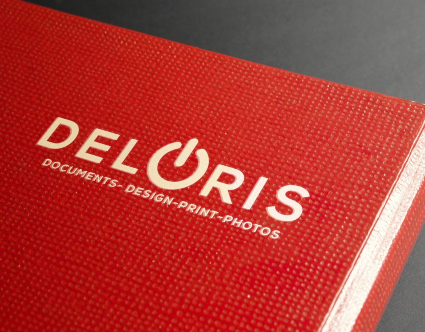
We developed a custom wordmark logo that puts clarity and impact at the forefront. The name “DELORIS” is styled in clean, modern uppercase typography — intentionally spaced for maximum legibility and balance.
At the heart of the design is a standout visual cue — the “O” replaced with a universal power symbol, cleverly reinforcing themes of capability, activation, and digital readiness. This subtle touch infuses the logo with a sense of energy and function, speaking directly to the brand’s promise: power up your projects with Deloris.
Beneath the wordmark, the tagline “Documents – Design – Print – Photos” establishes immediate clarity about the brand’s range of services, positioning Deloris as a go-to print and creative solutions partner.
The red leather-textured background in the mock-up complements the boldness of the logo, suggesting both quality and visibility — perfect for signage, stamps, packaging, or branded merchandise.
The final logo is vibrant, minimal, and powerful — adaptable across both digital and physical touchpoints. It reflects Deloris’s ability to get things done with style and efficiency, while staying relatable to their wide-ranging client base.


