Jewelry Manor: Luxury Meets Precision in Brand Identity
Crafting a Timeless Logo for a Modern Jewelry House
Project Summary
Jewelry Manor approached us to create a visual identity that would reflect their elegance, precision, and commitment to quality — all while standing out in a saturated luxury market. They needed more than a logo; they needed a mark of trust and distinction that could scale across print, packaging, and digital media without losing its refined feel.
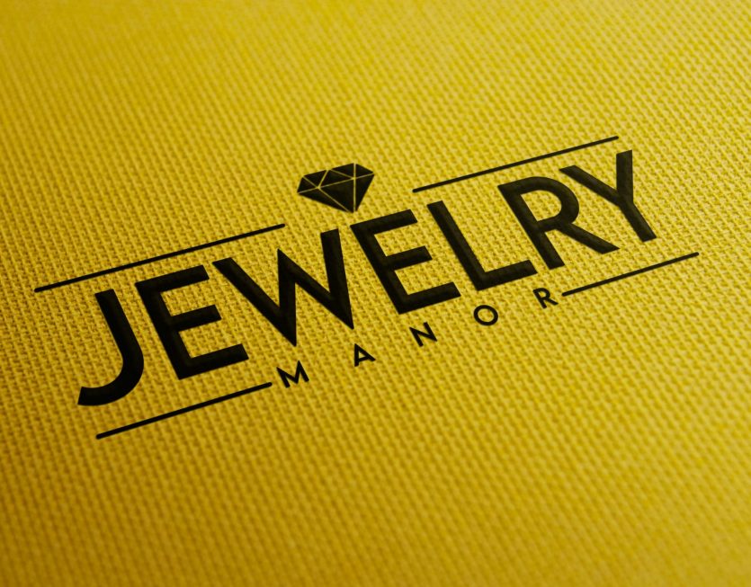
We began by exploring typefaces that captured a bold yet graceful tone. The final concept features a sleek, geometric sans-serif font with elegant spacing and high legibility — projecting strength, clarity, and modern luxury.
The name “JEWELRY” is framed by two parallel bars that stretch outward — symbolizing balance, sophistication, and the high-value experience that Jewelry Manor provides. Centered just above is a minimalist diamond icon, precisely shaped with angular cuts to reflect not only the product but the level of craftsmanship behind the brand itself.
The supporting text, “MANOR,” sits subtly beneath in a slim, spaced typeface — suggesting legacy, location, and trust. Set on a warm textured gold background for the mockup, the final design radiates confidence and quality from the very first glance.
The finished logo is clean, elegant, and deeply versatile — equally at home on a velvet ring box as it is on a digital storefront. Jewelry Manor now has a premium brand signature that reinforces their position as a modern curator of timeless elegance.


