RTC Shipping & Logistics: Brand Identity That Moves with Purpose
Designing a Strong, Professional Mark for a Modern Shipping Enterprise
RTC Shipping & Logistics needed a logo that could instantly communicate trust, global movement, and operational strength. As a company positioned at the intersection of air, land, and sea logistics, the visual identity had to be bold, versatile, and credible — designed for visibility across everything from shipping forms to warehouse signage and uniforms.
The ask was clear: develop a modern identity system that could scale with the brand as it grows.
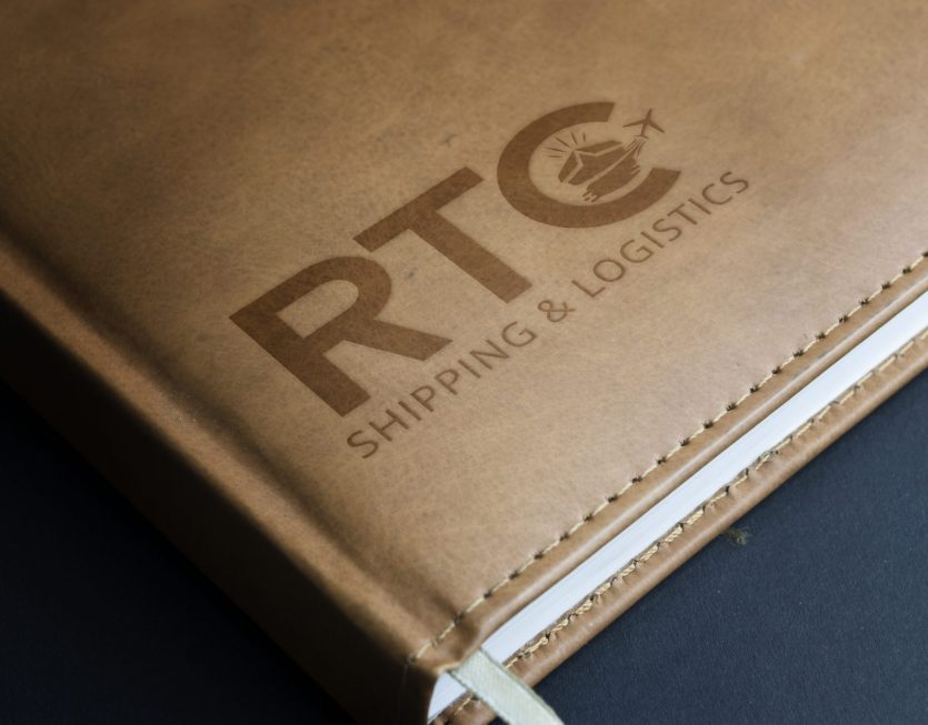
We created a streamlined typographic mark using bold, uppercase lettering for “RTC” — grounded, readable, and impactful. The logo’s standout element lies in the integration of dynamic iconography within the letter “C”: a stylized cargo ship and airplane set against a sunburst backdrop.
This visual blend captures the full scope of RTC’s offerings — from maritime and air freight to horizon-reaching logistics operations. The curved form of the “C” implies movement, direction, and cyclical flow — essential elements in the shipping and freight industry.
Beneath the mark, the tagline “Shipping & Logistics” is set in a clean, modern sans-serif font — precise, sharp, and balanced — reinforcing the brand’s commitment to professionalism and clarity.
Applied to a leather-textured mockup, the branding radiates reliability and authority — ideal for both digital presence and embossed documentation in the logistics sector.
RTC now has a brand mark that’s iconic, meaningful, and execution-ready. Whether printed on packaging slips, embroidered on staff uniforms, or displayed on digital invoices, this logo stands strong. It reflects movement, trust, and modern logistics — exactly what the client needed.


